Building a React component using 7 guiding principles
Learn about how to build a reusable, extensible, developer-friendly component with 7 simple design principles.


Table of Content
- Getting started
- Principle #1 - Zero prop rendering
- Principle #2 - Logical grouping
- Principle #3 - Type checking
- Principle #4 - Enums
- Principle #5 - Naming conventions
- Principle #6 - Explicit prop declaration
- Principle #7 - Custom debug messages
Ever needed to duplicate components because the one is too tightly coupled or performing multiple responsibilities or can't be re-used because of one of the hundred bad reasons? We stuck with such past decisions in life when we don't have guiding principles.
I have written dozens of React components and made tons of mistakes. As I progressed I identified common patterns, understood about APIs, extensibility, design principles, etc. In this article, I will document my learnings of building the React components.
We will need a small component where we can apply all the 7 principles. Remember, not all 7 principles need to be part of all the components. You have the freedom to mix and match these guiding principles to fill your use case.
For a quick demonstration, we will build a card component using 7 guiding principles. These principles will guide us to build a reusable, extensible, developer-friendly component.
You can find the code on GitHub where each commit is named after a principle.
🛎️ Ding! If you will feel that any content on images is not readable, I would suggest to clicking on it to get a large preview. Even if that doesn't work for you then I will be happy to explore and fix the problem.
Getting started
Let's assume that we will need the following props for the component. We will apply principles on these properties to build a solid <Card /> component.
| Prop | Description |
| title | The title of the card |
| subtitle | A subtitle just below title in smaller font size |
| description | A 2-3 line descriptions of the card |
| label | A capsule element to indicate extra info such as a tag |
| isSmall | Render a small size card |
| isLarge | Render a large size card |
| imageSource | A image url to render image on the card |
| rounded | Rounded corner on card |
| elevation | Box shadow on the card |
<Card title="Stay for 3 nights and get additional 10%*...!"
        subtitle="We at Star Hotel committed to..."
        description="We started rewarding our..."
        label="Summer offer"
        isLarge={true}
        imageSource="https://images.unsplash.com/photo-1582..."
        rounded={true} elevation={true} />

This is what the developer will see when they import the <Card/> component. I see there are a few issues with the above code and we will fix each one with guiding principles mentioned below.
Principle #1 - Zero prop rendering
Default props make your component to render functional UI even the developer hasn't passed any props.
This removes the barrier to consume the component and promotes development where you only need to add minimum props to modify the component to suit your needs.
React provides us the option to attach defaultProps in our component. We can be assured that when the parent component doesn't pass any value, the default props will provide those values to our component.
import Card from './Components/Card';

/* this should render Card component with a few default props. **/
return <Card />;

How do I decide on default props?
You need to audit where the components will get used and what's the most frequent variant of the component. Once you know that, you can configure default props for the most frequently used variant.
For example, If your product uses a large card more places than a small card then your default size should be large and likewise for other props.
I have listed what should be the default props for our <Card/> component.
| Prop | Default value |
| title | ' ' (empty string) |
| subtitle | ' ' |
| description | ' ' |
| label | ' ' |
| isSmall | false |
| isLarge | true |
| imageSource | placehold.jp/1024x786.png * |
| rounded | true |
| elevation | false |
Tip: *If your component doesn't know the props values beforehand then you should avoid passing placeholder values as default. You might want to conditionally render such elements. In a case where the prop value is needed to render the component appropriately then you can have a meaningful placeholder aligning with your brand such as a fallback image with more information.
| Prop | Default (Preferred) ✅ | Avoid ❌ |
| title | ' ' | 'This is title' |
| description | ' ' | 'The description goes here' |
Imagine that somehow you don't get the title from backend API and you are using placeholder value as default. The user will see 'The description goes here' on your production app. Instead, no title will make more sense.
Now, we know our default props, let's make the following change in the code.
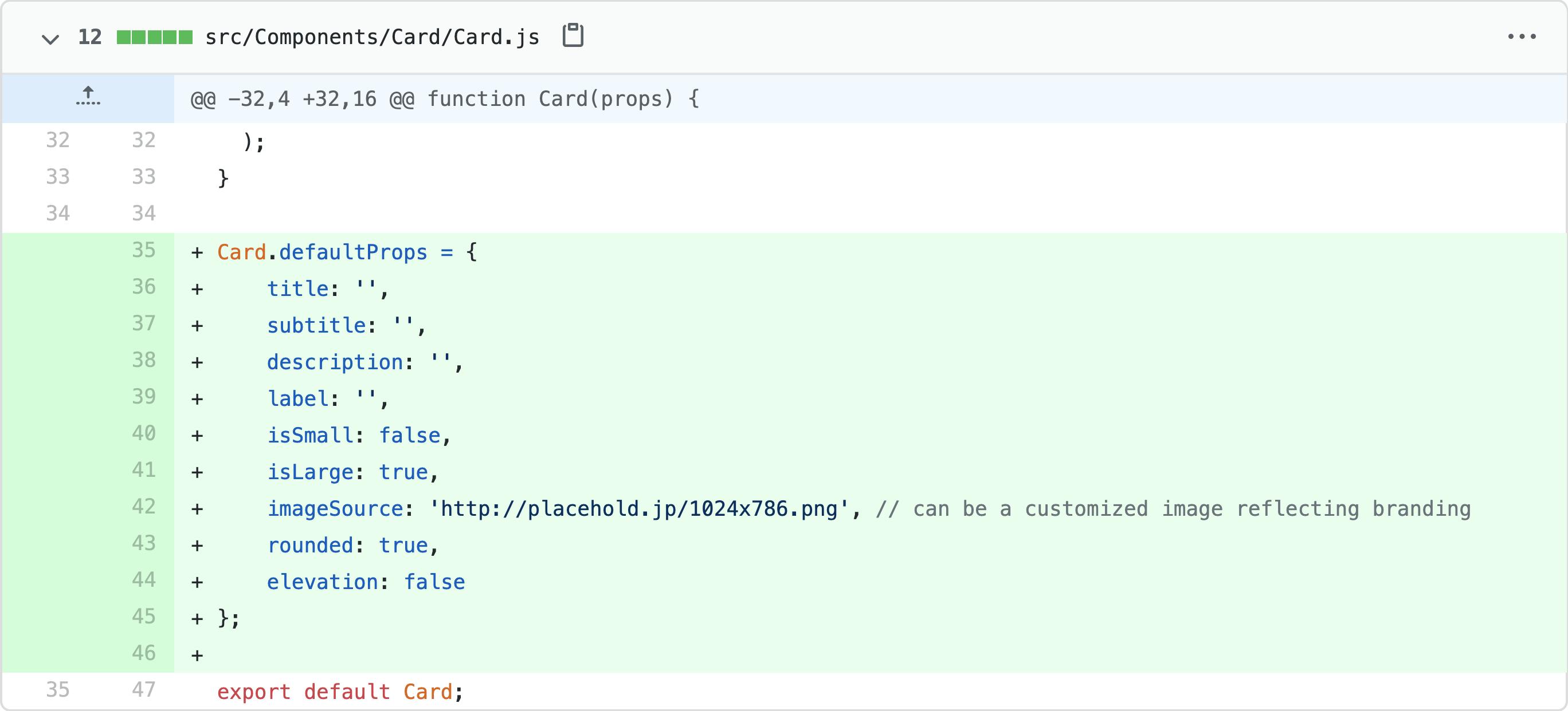
(Click to see large preview or check commit 1f84132)
Principle #2 - Logical grouping
Logical grouping allows you to reduce prop counts and make multiple related props to form a single logical prop.
In the worst case, we have a total of 8 props to pass in the component. Let's make the worst-case a bit better my logically grouping few props. Instead of title, subtitle and description we can group them together as content object and have the following structure -
content: {
    title: 'Stay for 3 nights and get additional 10%* discount on food',
    subtitle: 'We at Star Hotel committed to provide...',
    description: 'We started rewarding our customers.... '
}
This way we replaced 3 props with one logical prop. Now we can further extend the content field by adding more content related props rather than introducing new props to increase props count.
Consider another case where we need to pass the animation name, duration, and delay. Wouldn't it be much better to combine all 3 in animation object and add props in it? You can even extend this by adding more animation relation props such as direction, iteration count, fill mode, etc.
You can set a lenient rule that if your component has more than 5 props then you will exercise this principle.
Let's see what we changed in code to apply this principle.
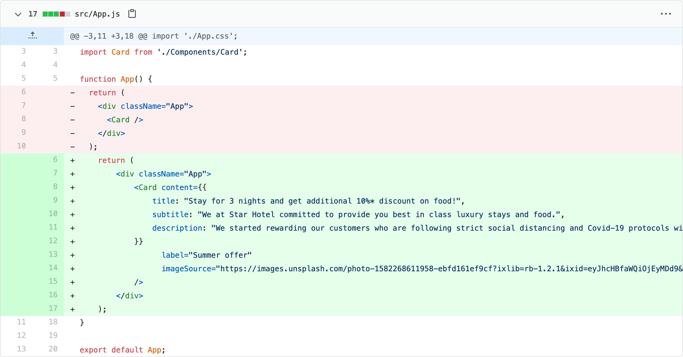
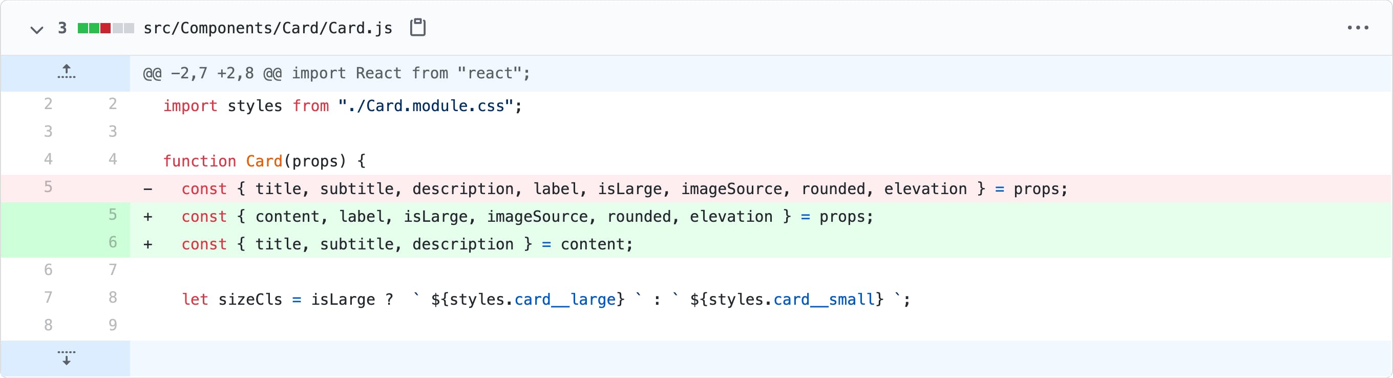
(Click to see large preview or check commit 9b42c0f)
Principle #3 - Type checking
A cheap and good way to catch static typing bugs while developing the component.
It's natural to make mistakes. We can't stop making mistakes but we can minimize it by putting mechanisms in the place. One of the mechanisms is React's support for propTypes.
At the compile time, you catch bugs caused by passing a wrong value type to a prop. This is highly recommended for application. If you are building a library or standalone component then you might want to write your custom and easy to debug error messages.
We will use 3 validators in our <Card/> component which I frequently use when I build components.
PropTypes.oneOfType
This validator restricts unwanted value types in prop when you are dealing with multiple values for a single prop. In our case, our card title can be a string or a node. We can strength our title prop using PropTypes.oneOfType.
title: PropTypes.oneOfType([
    PropTypes.string,
    PropTypes.node
  ])
PropTypes. isRequired
There may be a few props in a component that is necessary to render a functional component. You may use this validator to mark the prop as critical and the developer has to pass it.
In our case, it is again title and description. Though we have fallback values (empty strings) without that the card will lose its meaning. We can mark these two fields as required to make sure we get what is needed to render a meaningful and functional component.
title: PropTypes.oneOfType([
    PropTypes.string,
    PropTypes.node
  ]).isRequired,
description: PropTypes.string.isRequired
PropTypes.oneOf
This validator limits the specific values we can pass to a prop. This is a really interesting validator and work well with Principle #4. We will use this validator as we further progress with the rest of the principles. Though, I have a small example where I used this validator in the past.
Assume you have an Alert component where you want to have only 4 standard alert types viz. Info, Error, Warning, and Success.
You can use oneOf validator to limit values to only these allowed values.
alertType: PropTypes.oneOf(['info', 'warning', 'error', 'success'])
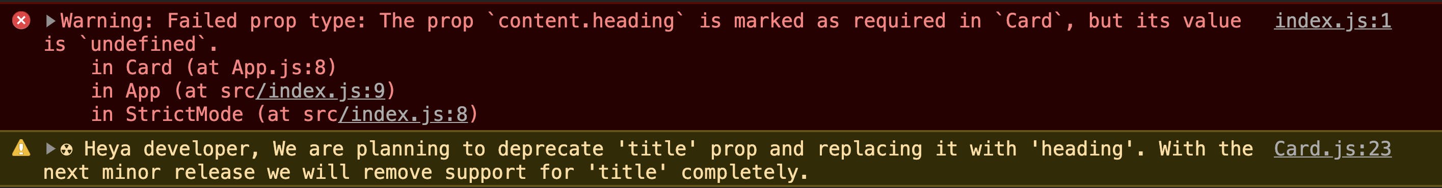
When you accidentally violate type checking rules then it will throw an error in the console. A descriptive warning will help you to trace and fix the violation.

(Click to see large preview of console warning)
Let's add type checking in our component to minimize risk of breaking component.
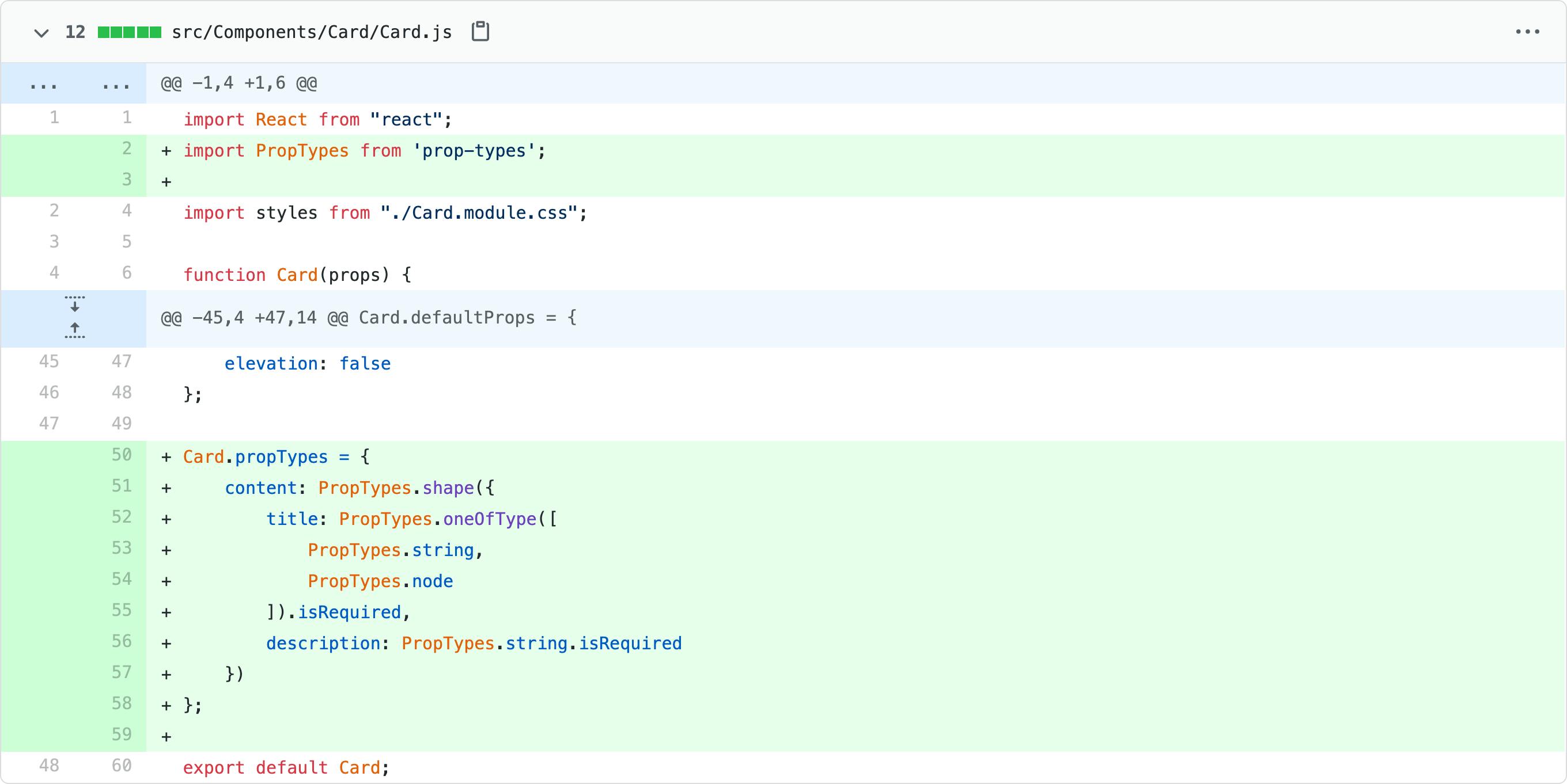
(Click to see large preview or check commit d70cb10)
Further reading –
Principle #4 - Enums
Enums are a good way to create paths for safe refactoring and make your code future-proof.
Imagine that you ask a developer to pass size="m" in the prop and suddenly you realize that it's obscure and we need to replace it with size="medium".
Now you can't expect your developer to make this change at 100 places. It's better to create constant such as SIZES.MEDIUM. Now you can internally keep it as m or medium it doesn't matter to consumer app developers.
The same principle we will apply to our prop. We currently have two props viz. isLarge and isSmall. What if we want to introduce extra small, medium, and extra-large sizes? What if someone passes both isLarge and isSmall as true?
Clearly, with the current way, we can't scale the size prop of our component and we are maximizing error risk.
We can create a single prop size and pass different enums to control different sizes of the components. You can again make it more robust by applying Principle 3 - oneOf typechecking.
The best part is you can expose your enums from the same component file. You will understand it better with following snippets -
// App.js
<Card size={Card.SIZES.Large} />
/* Card.js */

// if it is class based component
static SIZES = {
    Large: 'large',
    Medium: 'medium',
    Small: 'small'
}

// if it is functional component
Card.SIZES = {
    Large: 'large',
    Medium: 'medium',
    Small: 'small'
}
// Card propTypes
size: PropTypes.oneOf([Card.SIZES.Large, Card.SIZES.Medium, Card.SIZES.Small])
Sounds interesting? Now you can scale the size props to many values and if you want to avoid manual work then you can write a tiny function to iterate through all your size enums and format for oneOf array.
Let's refactor our props with this principle.
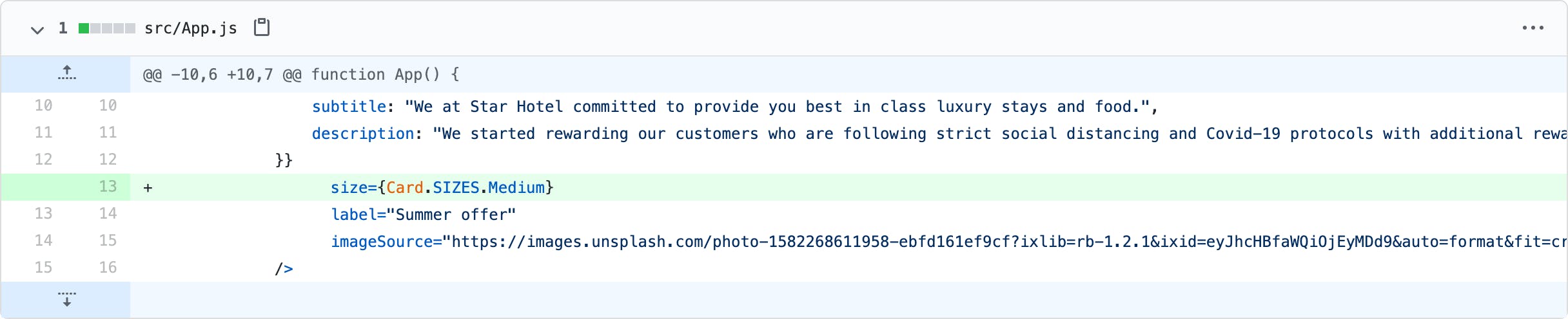
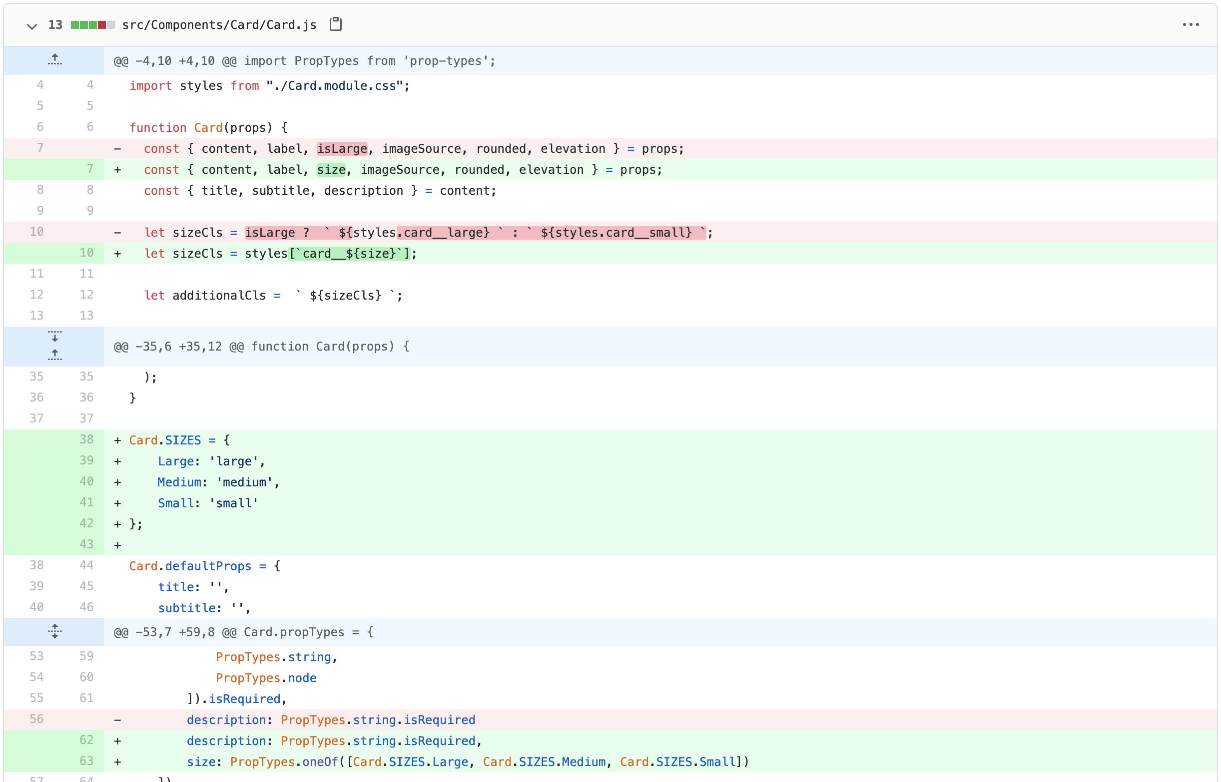
(Click to see large preview or check commit 88bc4c6)
Principle #5 - Naming conventions
A way to bring out the purpose of your code just by giving a meaningful name without putting efforts to dig in the code to understand its purpose
This is computer science's old problem. Though people come up with a few suggestions on approaching this issue. One of my favorites is the use of prefixes. You can use a prefix in few cases to make the prop name more intuitive such as -
| Convention | Description | Examples |
is- | Preferred for boolean values | isMobile, isRounded, isAdmin |
has- | Preferred for having an object or boolean values | hasAnimation, hasMultipleSelect |
can- | Preferred for giving ability/action | canProceed, canSave, canDelete |
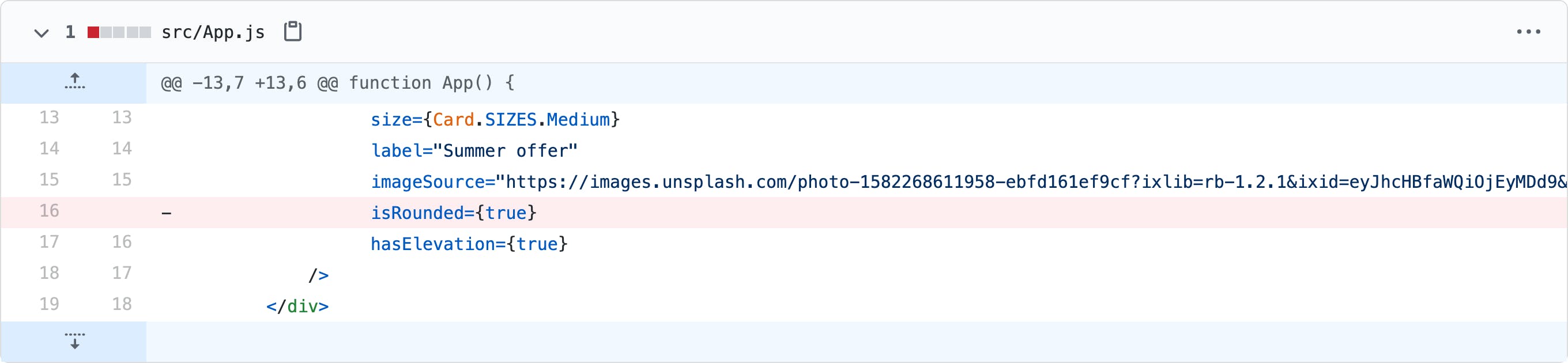
We will rename our rounded prop to isRounded and elevation prop to hasElevation. Do you see that readability has increased by using prefixes?
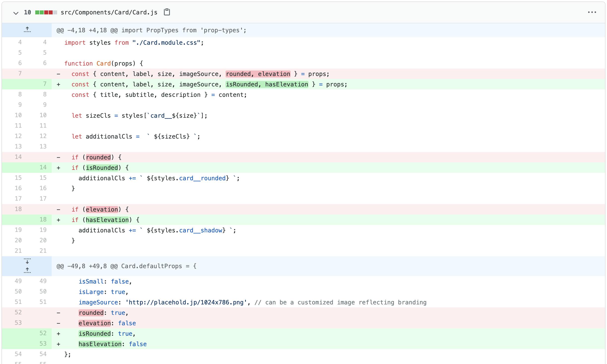
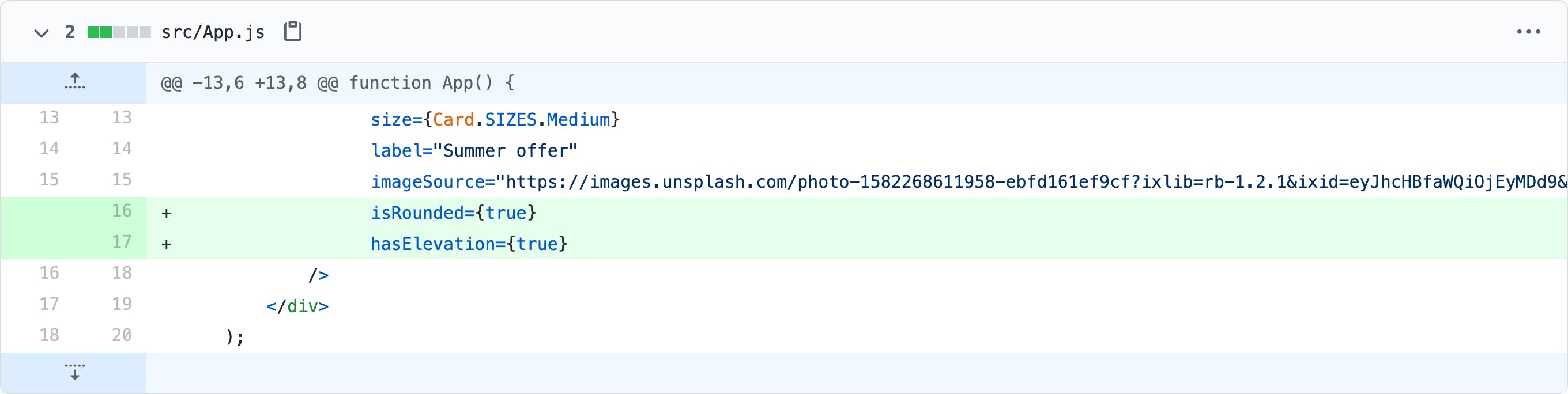
(Click to see large preview or check commit 004ad5c)
Principle #6 - Explicit prop declaration
Design APIs in a way that seeks what is needed and rest abstract away from developers to minimize making mistakes
This is follow up of Principle #1 - Zero props rendering. This states that you should only explicitly add prop when you want to change the default behavior.
For example, you shouldn't pass button type as default because that should be taken care of by Zero Prop Rendering principle. If you want primary button then only you will pass a prop otherwise rest should be covered as default props.
This is interesting. The explicit property should always convey positivity and should avoid passing negative values. For example, you should prefer passing isPrimary=true rather than isPrimary=false.
This way developers in your team will build a mental habit where they need to pass true to change component behavior and look rather than mixing a bunch of true and false values which may be confusing.
(Click to see large preview or check commit c5216af)
Principle #7 - Custom debug messages
Help your developers to understand, trace and fix the errors in humanly manner
Custom debug messages are advisable when someone is consuming your component. They might or might not get prop type warnings (depend on how you made available your component) for a variety of reasons.
You can always add custom debug messages to improve developer experience such as let's say when we want to change title to heading in the next update then we can release a new version with heading and backward compatible with title but a warning in the console.
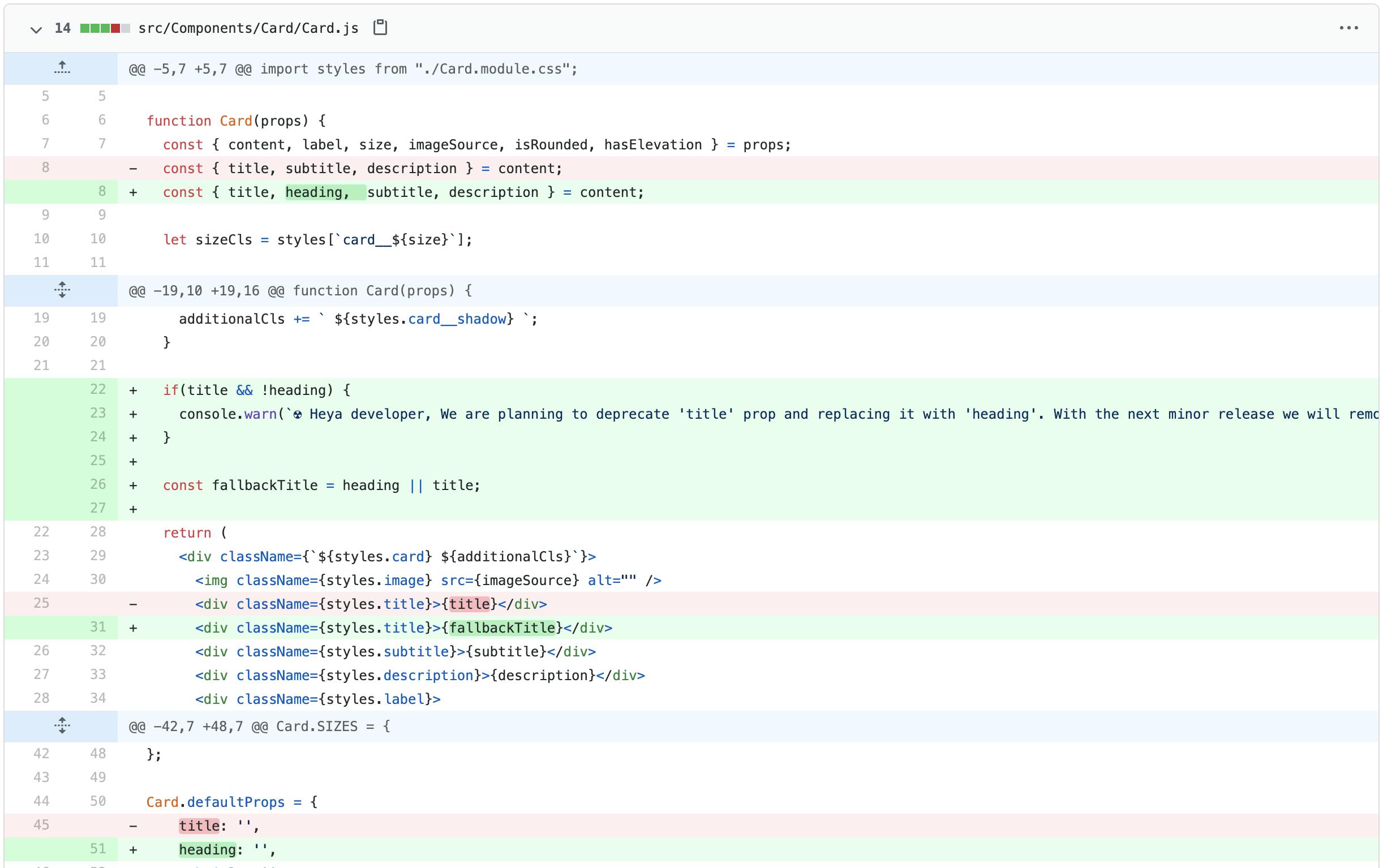
The custom debugs messages can be handy if you are planning to deprecate a prop, expecting values in a specific format, getting wrong type value, etc.
(Click to see large preview or check commit 22fbfaf)
Did I miss any interesting principles? I would love to expand this list, please post your guiding principle on Twitter and we are good friends.
Spotted a typo or technical mistake? Tweet your feedback on Twitter. Your feedback will help me to revise this article and encourage me to learn and share more such concepts with you.